How to color texture: wood, stone, metal and fabric
A coloring page tells you where the shapes are. It does not tell you that the shape is oak, granite or polished steel, and that is the difference between a page that looks filled in and one that looks real.
Here is how to color texture on any coloring page: the five marks every texture is built from, then step-by-step methods for wood, stone, metal, gold and fabric. Everything works with colored pencils, and most of it with markers too.
What does texture mean on a coloring page?
Texture on a coloring page is the pattern of marks, value changes and highlights that makes a flat area read as a material. Wood reads as wood because of grain lines, stone because of uneven speckled values, metal because of hard contrast and bright highlights. The line art gives the shape; your marks give the surface.
This is why the same brown can look like a barrel or a blur. Color is only half the job. The direction, spacing and pressure of your strokes do the rest.
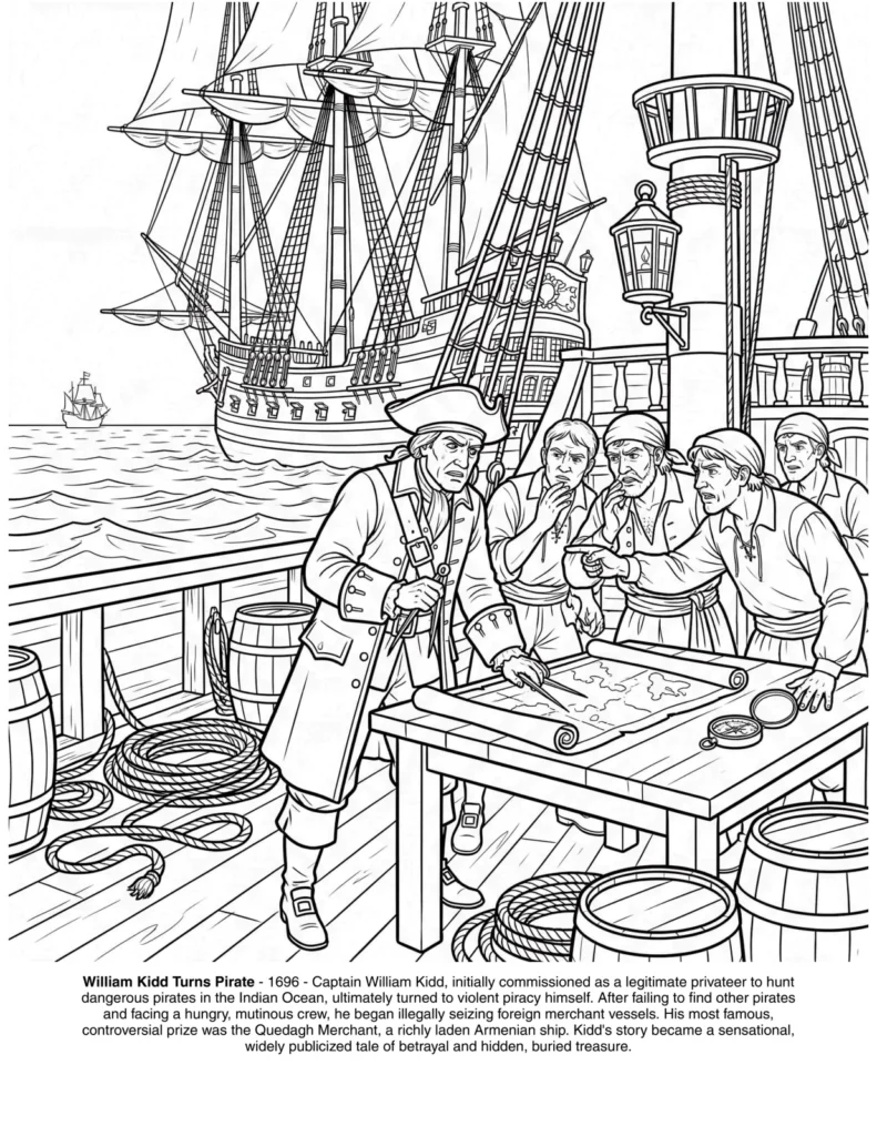
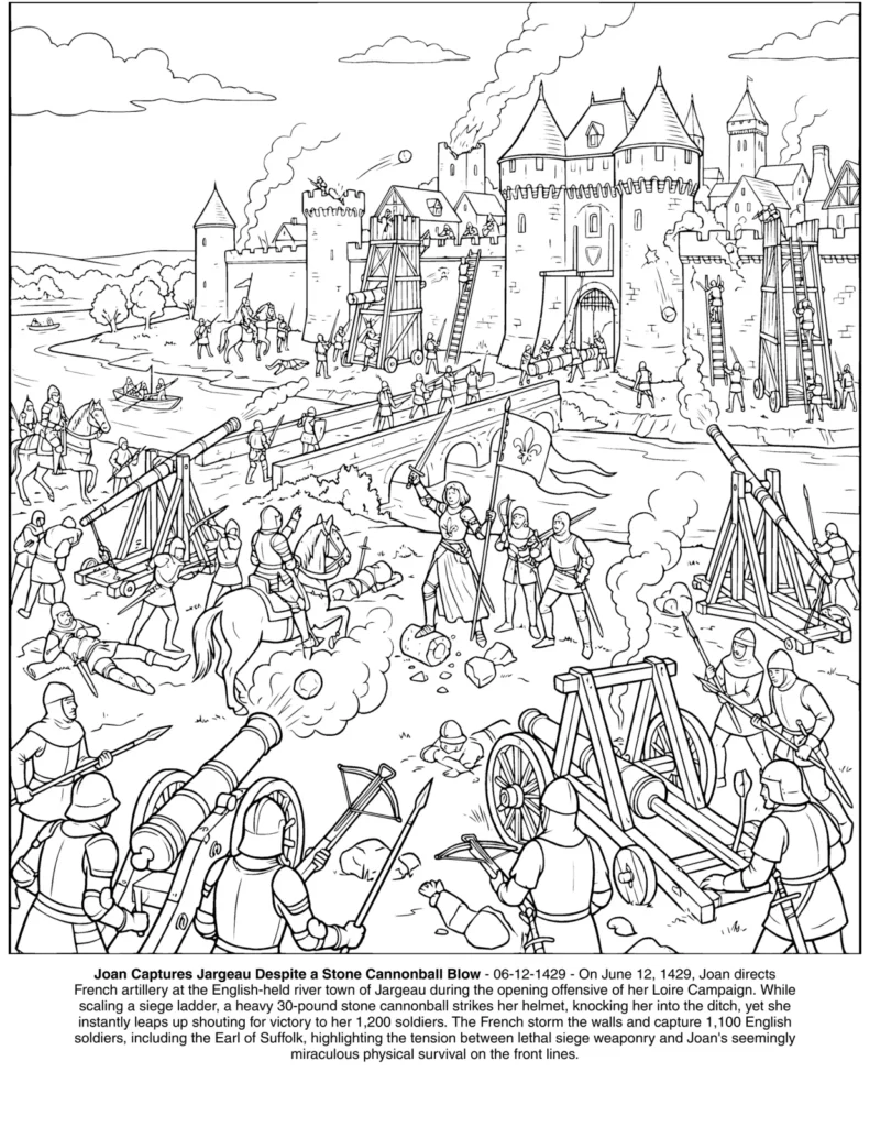
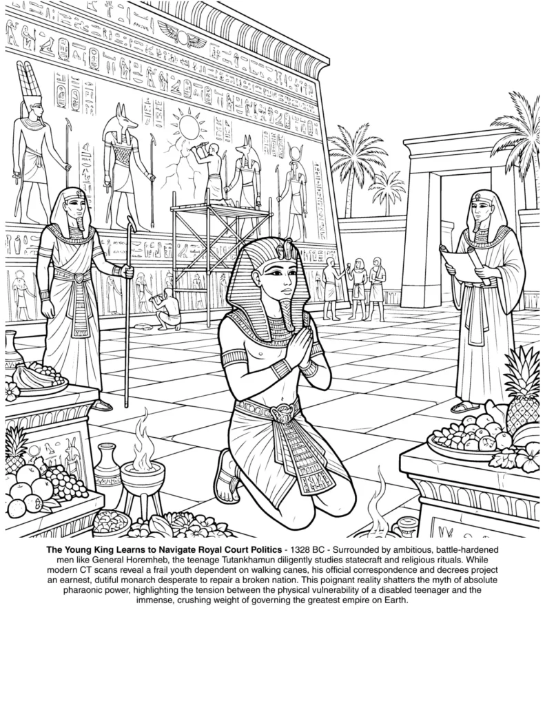
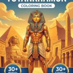
Detailed history pages are where texture pays off most. A scene full of real materials, armor in Joan of Arc, ship timber in The Pirates History, gold in Tutankhamun, gives you a reason to slow down on every surface.
The five marks behind every texture
Every texture you color is built from five marks: layering, hatching, stippling, burnishing and blending. Learn these once and each material becomes a combination of them. Practice them in small squares on a scrap sheet before you touch a finished page.
Mark
How to do it
Best for
Layering
Several light passes of different colors, building up slowly
Every material; the base of everything below
Hatching
Parallel strokes, close together, in one direction
Wood grain, fabric weave, brushed metal
Cross-hatching
Hatching in two directions on top of each other
Shadows, rough stone, coarse cloth
Stippling
Small dots or tiny circles, dense or sparse
Stone, sand, rust, weathered surfaces
Burnishing
Heavy pressure with a light color or colorless blender
Polished metal, gold, glossy wood
Pressure is the secret variable. Light pressure leaves paper tooth showing and looks soft or rough. Heavy pressure fills the tooth and looks smooth or shiny, which is why you save it for the end.
How to color wood grain
To color wood grain, lay a light base of tan or ochre over the whole plank, then draw thin darker brown lines that follow the length of the board, with an occasional oval knot. Add shadow where planks meet, then burnish with a light color if the wood should look polished.
Follow the line art. Planks, masts and barrels already have edges drawn, so keep each grain line inside one board and let it run the long way. Vary the spacing: wood never has perfectly even stripes.
Weathered wood, like a ship’s deck, needs the opposite approach. Skip the burnishing, add grey into the brown, and break the grain lines into short broken strokes with lighter gaps between them.
Timber, rope and canvas: a page full of textures waiting for color.
How to color stone and brick
To color stone, mix two or three greys or warm earth tones unevenly across each block, so no two stones match. Stipple darker dots for pitting, draw thin cracks with a sharp dark pencil, then darken the joints between blocks and leave the top edges lighter, as if light falls from above.
Inca walls are the perfect practice ground, because every stone has its own shape and fits tightly against its neighbors. Color the stones one at a time, and change the mix slightly for each one.
For brick, start with a red-orange base, push one or two bricks toward brown or pink, and keep the mortar a dull grey-beige. A few chipped corners, left lighter, make the wall look old.
To color metal, use strong contrast: very dark greys and blues right next to bright white highlights, with little in between. Leave the highlights as untouched white paper, follow the curve of each armor plate with your strokes, and add a touch of blue or brown to suggest the sky and ground it reflects.
The mistake most colorists make is filling metal with one medium grey. Real steel is mostly reflections, so the darkest dark and the lightest light sit side by side, especially on curved plates like a breastplate or a helmet.
Plan your highlights before you start, because you cannot get white back with colored pencil. If you lose one, a white gel pen restores a sharp glint on top.
Armor and banners: metal and fabric on the same page.
Get 5 illustrations from our bestselling coloring books, for free.
You will receive in your mail box the link to download the 5 illustrations in high quality and PDF format.
How to color gold so it looks like gold
To color gold, never use yellow alone. Start with a light yellow base, shade with yellow ochre, orange and a warm brown in the folds and recesses, and keep a few spots of bare white paper for the shine. Burnish the light areas last to give the surface its polish.
Gold is all about the shadows. Brown and even a little purple in the darkest areas make the yellow around them look brighter and richer. The more contrast you build, the more the object seems to glow.
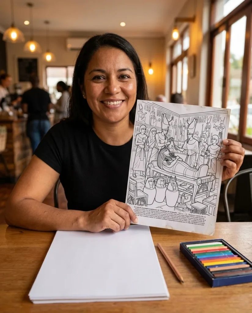
Tutankhamun’s treasures are the classic gold challenge: the mask, the coffins, the jewelry. If you love that period, our guide to gifts for ancient Egypt lovers starts with the same book.
Gold, stone and painted walls from the tomb of the boy king.
How to color fabric, leather and fur
To color fabric, think in folds rather than texture. Shade the inside of each fold darker and leave the ridges lighter, using smooth layered strokes that follow the direction of the cloth. Add a pattern or weave only at the end, and bend it with the folds.
Different cloths need different finishes. Linen and canvas stay matte, with light hatching. Silk and satin need sharp highlights, almost like metal. Velvet is dark everywhere except a soft glow along the raised edges.
Leather sits between wood and fabric: a warm base, soft folds, and a few fine creases at the bends. Fur and hair are short hatched strokes in the direction of growth, layered from dark to light.
Texture cheat sheet and the tools that help
The quickest way to color texture well is to match each material to its mark, pressure and highlight. Keep this table beside you while you color. Most textures need only two or three pencils, a sharp point and patience, plus a colorless blender or white gel pen for the finish.
Material
Base
Marks
Shadow
Highlight
Polished wood
Tan or ochre
Long hatched grain, knots
Dark brown between planks
Burnish with cream
Weathered wood
Grey-brown
Broken short strokes
Dark grey
Leave gaps of paper
Stone
Two or three greys, uneven
Stippling, cracks
Dark joints
Lighter top edges
Steel and armor
Light grey
Strokes following the curve
Near black, blue
Bare white paper, gel pen
Gold
Light yellow
Smooth layers
Ochre, orange, brown
Bare white, burnish
Fabric
Mid tone
Smooth strokes along the folds
Inside the folds
Ridges of the folds
Paper matters as much as pencils. If you color printed pages, use 120gsm paper or heavier so the surface takes many layers and some burnishing; our PDF vs physical coloring book guide covers paper weights for every medium.
What is the easiest texture to color for beginners?
Wood is the easiest place to start. A light base, a few darker grain lines that follow each board and a little shadow between planks already read as wood, and the line art usually shows you where every board begins and ends.
How do you make colored pencil look like metal?
Use strong contrast instead of a single grey. Put very dark greys or blue right next to bare white highlights, follow the curve of the surface with your strokes, and burnish the lighter areas. A white gel pen adds a final glint.
What is burnishing in coloring?
Burnishing is coloring with heavy pressure, often with a light pencil or a colorless blender, until the paper tooth is completely filled. It blends layers into a smooth, shiny surface, which is ideal for polished wood, metal and gold, so it is usually the last step.
Can you create texture with markers?
Yes. Use stippling, short strokes and layering with a lighter and a darker marker, and let some of the first layer show through. Markers blend less than pencils, so many colorists lay a marker base and add the texture on top with colored pencils.
What paper is best for texture coloring?
For printed pages, 120gsm or heavier smooth paper takes enough layers for texture and burnishing. Use 200gsm or more if you work with alcohol markers or watercolor underneath.
Give every surface its own texture
Five marks, a few pencils and a plan for the highlights: that is all it takes to make wood look like wood and armor look like steel. Start with one material and add another on your next page.
Pick a page with real materials, a ship’s deck, a stone wall or a golden mask, and try one method from this guide tonight.
We use cookies to enhance your browsing experience, serve personalized content and analyze our traffic. You can accept all cookies, reject non-essential ones, or manage your preferences.
Required for the website to function and cannot be switched off. They are usually set in response to actions you make, such as setting privacy preferences or logging in.
Allow the website to remember choices you make (such as language or region) to provide enhanced, personalized features.
Help us understand how visitors interact with the website by collecting and reporting information anonymously.
Used to track visitors across websites to display relevant advertising and measure campaign effectiveness.